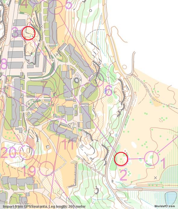
The Norwegian Craft Cup sprint had several interesting route choices. Here we present one of them as an O-Route Challenge. Which route would you have chosen?
The chosen leg is the third leg on the M21 course. The leg is as usually first provided without routes – you may take a look at it and think about how you would attack this leg (if the image is too small, you may click on it to get it larger).
Webroute
Next you can draw your own route using the ‘Webroute’ below. Think through how you would attack this leg, and draw the route you would have made. Some comments about why you would choose a certain route are always nice for the other readers.
Discussion
You can find the full GPS tracking and course from the event here. See also the womens course. But first take a look at the analysis below – and draw your route for two more legs further down on the page.
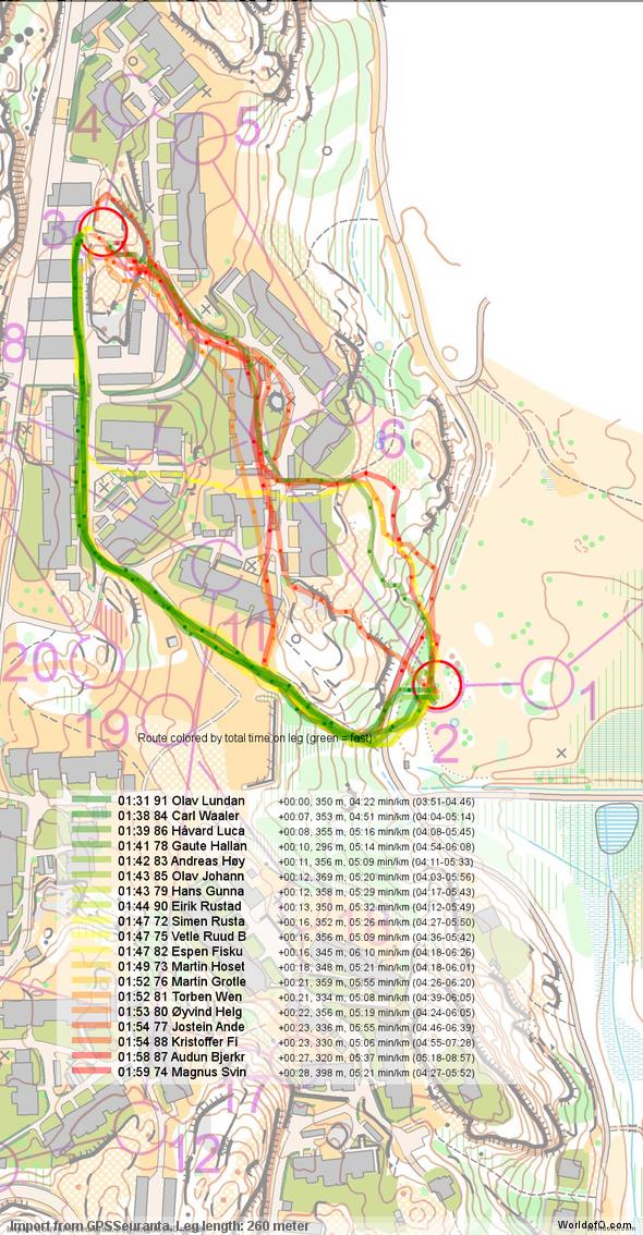
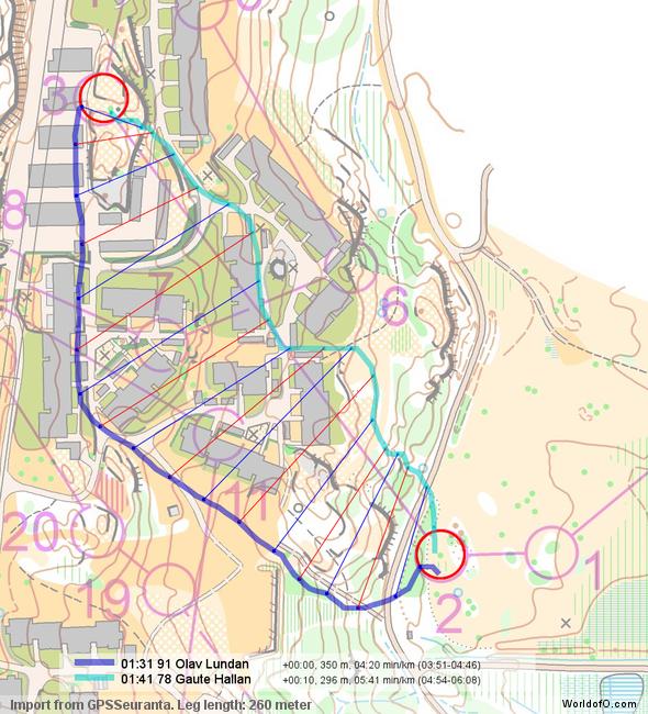
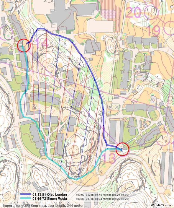
Below you see a graphical analysis of the leg based on the GPS-data of some of the fastest runners between these controls (click on an image to see a larger version of it). Note that for this particular leg the times are significantly off for the GPS due to inaccuracies at start/end of leg. However, focusing at the overall picture (see the color-routes below) and the direct comparison of the best GPS-runner on the left and direct routes (see below), it seems pretty clear that the left route – taking the control from behind – is significantly better than the direct route. What is always interesting is also that most of the top runners did recognize this, and chose the leftmost route. Note that I didn’t run this particular competition and I also didn’t study all split times in full detail – thus I might be wrong in my analysis. Please correct me in the comments if you disagree in my analysis.
Figure: Routes are colored according to total time on the leg – green is fast, red is slow.
Figure: Direct comparison between routes. Points along the routes at which the runners have used the same time are connected – thus you can easily see where one route is faster/slower than another.
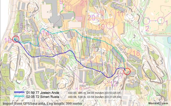
Leg 16-17
Now you can take a look at a graphical analysis of the leg based on the GPS-data of some of the fastest runners between these controls (click on an image to see a larger version of it). Note that times are off the GPS, so there might be some inaccuracies at the start/end of each route/track.
Points along the routes at which the runners have used the same time are connected – thus you can easily see where one route is faster/slower than another.
Leg 13-14
Now you can take a look at a graphical analysis of the leg based on the GPS-data of some of the fastest runners between these controls (click on an image to see a larger version of it). Note that times are off the GPS, so there might be some inaccuracies at the start/end of each route/track.
Figure: Direct comparison between routes. Points along the routes at which the runners have used the same time are connected – thus you can easily see where one route is faster/slower than another.
 World of O News
