 World of O News
Today Route to Christmas takes another big step forward by introducing GPS analysis of today’s route – including a pace map and a calculation of the optimum route based on the GPS data. On top of that, the leg is also a nice one for you: A very long one from the Swedish Elitserien event of May 15th this year.
The leg is as usually first provided without routes – you may take a look at it and think about how you would attack this leg (if the image is too small, you may click on it to get it larger):
![]()
Webroute
Next you can draw your own route using the ‘Webroute’ below. Think through how you would attack this leg, and draw the route you would have made. Some comments about why you would choose a certain route are always nice for the other readers.
Then over to an analysis of the leg. With full GPS data of 20 runners instead of only Routegadget-data, it is possible to say a lot more about what is the best route than in the previous editions of Route to Christmas. The leg is maybe not the most interesting one as there are several routes which are approximately the same time, but still the following analysis gives some interesting information – and also shows how it is possible to analyze a leg using GPS data.
First we take a look at the routes of the fastest runners for the leg (note that the split times are based on the GPS data and not on the actual split times). As you can see from the routes, the direct variant and the left variant are approximately equal in time – whereas the right variant is somewhat slower based on the GPS data.
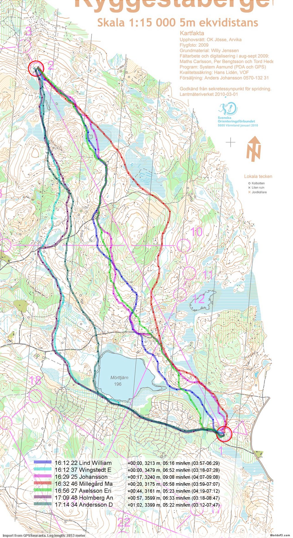
To get a better overview of all the possible choices for this leg – and how they relate to each other, we can plot each route with a color corresponding to the total time used for the leg (green is fast, red is slow). As you can see, there are a few green routes direct, a few left and one right. There slower options are also quite evenly distributed – with a few more on the left.

The next illustration is an interesting one. This illustration shows the minimum pace (in minutes/kilometers = maximum speed) for any given area on the leg on which one or more runners have been during the leg. Thus, if one runner has run in 5:00 min/km and another one on 6:00 min/km in an area, the area is given a color corresponding to 5:00 min/km. Thus all the green areas are the areas with good runnability and the red areas the ones with bad runnability. Following the left route along the left edge of the lake, you can see how the running speed is slower (towards yellow) at the south-west edge of the lake where the path is smaller and running through a marsh. One can also see how the speed is reduced in the light green / stony areas towards the end of the leg – and also the lower speed in the marshes.

We are still not finished with the analysis – now the fun part starts! With this speed map, we have actually got a lot of information which can be used to calculate the optimal route. Of course we have only got speed data for areas where a runner has been with a GPS during the leg, and therefore the calculated optimal route will have to go through areas where a runner has been. Below you see the calculated optimal route (in black) compared to the routes of the 5 fastest runners. As you can see, the calculate optimal route is a left variant – quite similar to the route of Emil Wingstedt for most of the leg. There are however some differences in some parts of the leg – this is because other runners have had a faster time for this part of the leg by choosing another micro-route-choice here. Thus for this particular case there are no big differences between the fastest route run by a runner and the calculated optimal route.

The algorithm for calculation of the optimal route (see more details below for the technically interested) gives some other interesting information: The fastest route to any point on the map which is reachable based on the speed information from the GPS data – and also the (relative) time it takes to get there. Thus, it is possible to make an illustration which gives information about why the optimal route is the optimal route. The illustration below is one way of displaying this information (please add a comment if you have a better idea – I have been trying many alternatives already and found that this was the best option so far). In this illustration, the starting point is set at the first control. Each position on the map is now colored based on how long it takes to reach it from the first control. Thus, all spots which it takes the same time to reach have the same color. Getting from the start to any of the dark red bands takes the same time. Correspondingly for the green, blue, yellow bands and so on. Note that the colors give the time it takes to get there, and says nothing about which way to get there. In addition to the color bands, the calculated optimal route is shown in black.

For some legs, this type of illustration can be used to find out where the control should have been placed in order to make another route be faster – this will be exemplified in a later edition of Route to Christmas. It can also be used to get an understanding about the dynamics of a leg – i.e. the difference between the different route choice options.
Technical background
A little bit of technical background about how there illustrations are made – more will come later on:
- The leg is divided into a grid of around 1000×1000 (actually different grids have been used for some of the different illustrations above), and a speed is assigned to each grid cell based on the speed from the GPS data. I have worked both with average speed and maximum speed for each grid cell, and found that maximum gives the most correct results.
- Using the speed data from this grid, I assigned the time it takes to get from any grid cell to an adjacent grid cell – either horizontally, vertically or diagonally. Based on this one can calculated the time it takes to get from any place to any other place on the grid.
- Next I used Dijkstra’s algorithm to find the optimal path from the start control point to any other point in the grid by checking all the possible options (of course only using cells which have information about speed data – and only to/from cells where runners have been during the leg)
- Using this data, it is easy to plot the optimal route from the start control point to the end control point. This optimal route is not necessarily equal to the best route by a runner, but rather takes different segments from different runners to find the best overall route.
- Also using this data, it is possible to move the control a bit to either side, and see which route is the most optimal route for this control position (still only using the cells for which there is GPS data)
- Finally I plotted all spots to which it takes the same time to arrive to in the same color. Note that there is no information in the illustration about which way you should go to get there, but it is mostly possible to see by following the color changes.
- There are still a lot of interesting possibilities not explored here, but this type of analysis can surely be helpful in understanding the challenges and optimal routes in any terrain based on GPS data.
- A possible extension would be to assign speed data to cells for which there is no GPS data – i.e. either extract data from an OCAD file or allow the user to “draw” pace in different areas to test different routechoice options. Actually, there is an article in the Scientific Journal of Orienteering doing a theoretical analysis of optimal route choice based on only calculated values for the speed based on OCAD data and altitude model.
There are probably not many of you reading all the way down here – but if you have come all the way down here, I would appreciate a comment about the usefulness of this kind of analysis! I have now got a setup which makes it possible to make these kind of analysis for hundreds of events with very little manual work – making it very interesting to explore this further!
Complete map in Omaps.worldofo.com
You find the complete map and Routegadget info in omaps.worldofo.com at this location.
Omaps.worldofo.com
The ‘Route to Christmas’ series at World of O was very popular the last years – and I’ve therefore decided to continue the series this Christmas as well. If you have got any good legs in RouteGadget from 2010-competitions – or old forgotten ones which are still interesting – please email me the link at Jan@Kocbach.net, and I’ll include it in Route to Christmas if it looks good. Route to Christmas will not be interesting if YOU don’t contribute.
There will be no analysis about the best routechoice for each leg – you can provide that yourself in the comments or in the Webroute. Not all legs are taken for the interesting routechoice alternatives – some are also taken because the map is interesting – or because it is not straightforward to see what to do on a certain leg. Any comments are welcome – especially if you ran the event chosen for todays leg!


you’re a genius
Jan, this is the best ever “Route to Xmas” article, really great work!
(I was very pleased to notice that the optimal route turned out to be _very_ similar to the one I submitted above. :-)
It might be possible to interpolate/extrapolate speed values for grid points with no runners in them, by taking the slowest nearby grid and then guessing that non-used areas will be successively slower the further they are away from a used grid point.
I.e. this will allow the algorithm to link together pairs of used tracks by setting a somewhat pessimistic speed for the “white space” between them.
OTOH, simply reducing the grid resolution will cause a similar result, but that could easily lead to obviously wrong results, like a “best path” that jumps over an uncrossable boundary like a long cliff face.
Thanks, Terje. I have looked at various (automatic) ways of getting data for the cells for which there is no GPS data, and I have not found any method which I think can be trusted. But your idea with “taking the slowest nearby grid and then guessing that non-used areas will be successively slower the further they are away from a used grid point” is better than the ones I have had so far, so I might just try to implement that.
What I think would be useful is a graphical tool where you could “draw” the pace using colors. Also, I think it could be possible to interface with the real map data from OCAD, but that is really a lot of work, and it won’t be so generally applicable.
Very interesting. Looking forward to future analyses.
Not many laps have so varied macro route choices, as todays route to christmas. I could imagine that this kind of analysis will be most beneficial in comparing en-route micro choices. As an average orienteer, I plan macro route and final approach, but often neglect the importance of the micro decisions inbetween.
This was a special leg in that regard, yes. This does give interesting results for many less complicated legs as well, I’ll give you another one already tomorrow:)
Thanks a lot, Jan! Really nice analysis.
You wrote that you have some setup. Is this a software or what?
And how it’s going with 3D Rerun?
This is not part of 3DRerun – it is something that (for now) can only be run locally using perl for calculations and generation of illustrations and php/javascript for picking out the legs/runners.
3DRerun is still in closed beta (if you haven’t got an invite, just send me an email and ask for it). It is still too complex with too many options, so I have to shave away some parts to get it usable by non-experts. And there are some issues in Internet Explorer. I’ve put priority on Course of the Year, Achievement of the Year and Route to Christmas the last months, and neglected 3DRerun development (but am using it regularly myself:).
Interesting similar project using ground shape and runnability http://www.oskarlin.com/2008/03/06/orienteering-route-choice-with-gis/#more-457
Thanks for the link, Graham. I hadn’t seen that one. The article I link to in the text (by Felix Arnet in Scientific Journal of Orienteering) is on the same topic, but a lot more detailed. Really a good read – you should take a look if you haven’t seen it before. I was surprised to see that the method he used was with theoretical data was exactly the same that I had planned to use with GPS data:)
Thats brilliant, thanks.
I suspect the automatic calculation of min/km for the route has a few glitches (e.g. I calculate Johansson’s speed as 5.08 min/km, slightly better than 9.08 min/km!) .
Cheers
This seems to be the speed on the last meters.
Not sure why 9.08 comes out there – it looks like a bug, yes…
Thanks for great analysis..
Such things could move forward our sport and all ambitious runners should read it carefully…
Anyway whole Route to Christmas project is very nice and useful for all orienteers during winter time…
Thanks for the positive feedback:)
I clap my hands!
Some thoughts though:
> It ain’t a big surprise, that by this analysis one route of the ‘fastest actually run’ turns out to be the ‘best’ route. Espescially in a field of runners of that quality, the ones running fastest splits need to have found aprox. the best routes.
> Don’t forget, that the method would not find ‘best’ routes anyway, when its only run by not so strong runners.
> The slight difference to Wingsteds-Route is realized by routeparts of Stenström, Liljequist and Rost. How much time does Wingsted actually loose there? Is this margin more than ‘Bad Luck in the Green’? How much is the difference between the best route calculated and the one calculated along Linds route? How much is the difference between the ‘phantom-time’-calculated and the one a runner is actually able/willing to run?
> What is the influence of the limitation, that routes only can cross a cell horizontal, vertical or diagonal. Do the that way compared routes have realistic proportions. for ex. Wingsted vs. Lind?
> As long as the analysis is based on ‘acutally run’, I expect the results usually to be minimally more than just the route of the fastest.
> A strong point of the analysis I see in the last graph. This kind of graph could help to develop a certain feeling for the long route choices. I’d like to see some isochrones there…
> It ain’t a big surprise, that by this analysis one
> route of the ‘fastest actually run’ turns out to be
> the ‘best’ route. Espescially in a field of runners of
> that quality, the ones running fastest splits need to
> have found aprox. the best routes.
Agree about that. But for several of the examples I have looked at, it is interesting to see where the control should have been placed in order for another routechoice to be better. Also, I guess that for some cases you could have one runner doing the first part of the leg optimal and another the other part of the leg.
> Don’t forget, that the method would not find ‘best’ routes anyway, when its only run by not so strong runners.
I think if you have a lot of not-so-strong runners, it could be quite useful anyway. But with fewer runners, it won’t be to good, no. Still I think it could give you some additional insight into the leg (but you shouldn’t trust the results blindly:)
> The slight difference to Wingsteds-Route is realized by routeparts of
> Stenström, Liljequist and Rost. How much time does Wingsted actually loose
> there? Is this margin more than ‘Bad Luck in the Green’?
Probably not:) I haven’t looked too much into these things yet, but at least I’ve got a tool to play with now…
> What is the influence of the limitation, that routes only can cross a cell
> horizontal, vertical or diagonal. Do the that way compared routes have
> realistic proportions. for ex. Wingsted vs. Lind?
Based on the article by Felix Arnet, it shouldn’t be. The cell size would be a bigger problem. Reducing the cell size (but still using the same grid for setting speed based on GPS-data) would probably be the best option.
> As long as the analysis is based on ‘acutally run’, I expect the results
> usually to be minimally more than just the route of the fastest.
Yes and no. There shouldn’t be too much more information in there, but it should be a good way to visualize GPS data from many runners (which I have found problematic for analysis purposes earlier). The calculated optimal route is not too useful, but the last illustration (with the colors) I think can be very useful. Also, the analysis of where a control should be moved in order for another routechoice to be optimal I think is also useful. This could especially be for an elite runner who need to get routechoice decisions “into the blood”
The visualization part of it is indeed great!
It is great read. Do you think it makes any sense to produce two more graphs
a) optimal route – course – compare with routes of 5 best runners – show time diference to optimal route
b) optimal route – course – compare routes just with runners who have the best split times on each leg – show time diference to optimal route
Just to see imporatance of their mistakes a little bit batter and not just where they make perfect route choice. Also to see good alternative route choices where there are eaqual to optimal route.
Thanks, Samo. Working on the complete course is still somewhere in the future – not sure if I am going to go in that direction just yet. There is still a lot to do only on the leg itself:)
Regarding times for the optimal route compared to the other routes, that is something I’ll look into. Curious about the accuracy of the times there. Good alternative routes is a bit tricky to get out automatically with the current algorithm, but I’ll see what is possible.
Now you have presented optimal route as a line but some micro routes on the leg are often very similar to optimal route where runners need app. same time and micro routes left and right could also be treated as optimal.
Could you show on the basis of all routes optimal route with corridor where it is possible to run with app. same speed? Corridor could be wider just in some parts of the leg. In that case runners could see suggested optimal corridor and how much of their route was probably in that zone.
I think a lot of that information is really in the last illustration. Automatically making a corridor showing that information feels like difficult to make, but I’ll think through it and see if I find a way. Thanks for the feedback.
greate work!
what about writing a small java app for my handy, which takes a photo of the next leg and calculates the fastest route:)
what software do you use for your analyses? or what programming language?
best regards
moritz
No Java app for you – I’m sure you can train yourself up to do it in your head:)
As I wrote in a comment above, it is made using perl for calculations and generation of illustrations and php/javascript for picking out the legs/runners. Calculation effort is too big to make this available online. I’ve used perl/php/javascript because these are the tools I’m comfortable with. Getting up an analysis for a completely new leg takes less than half a minute to pick out the leg of interest/runners to include in a web interface, and between 1 and 5 minutes of calculations for the computer depending on leg length, accuracy required, analysis required and so on – then all figures are output as jpg. All software is written by myself – I’m not using any GIS tools (although I’m sure that would be possible as well). The algorithm to find the optimal path is not optimized – I’m sure it would be possible to cut down the time a lot if one really tried for it:)
Jan, this is piece of art. I think some national team should pick you up as a data analyst, because this is next level of technical skills development. Thanks!
Thanks for the praise:) I’m actually already helping the Norwegian team with analysis on a few training camps.