– And if we have this dot, I wonder do we actually need the feature, Routegadget asks on Facebook. – Wouldn’t sprint be better without control descriptions?
Following up on yesterday’s post on clarification dots: Do we need control features in sprint orienteering, or could we put that dot anywhere?
– We could also place controls anywhere we want, that would make it easier to set up interesting optimized route choice legs without having to build those artificial “fodder racks”, Routegadget commented on a post on the topic last year – and repeated the arguments in the comments on yesterday’s article.
What do you think? Take it another step – remove the control description – and place the controls anywhere? Maybe for Sprint Relay as a start – that’s a discipline where this could really be advantageous.
 World of O News

What about controls which can be located on top and under an object. It will be impossible to understand just from the dot inside the circle.
I think that controls should be always placed on an object it`s no so difficult to create an object if there is nothing on the terrain. Otherwise it will be possible to put many controls 15m from each other and how runner should understand which one is right?
The main problem – sometimes it will be difficult to place the control flag into precise position, results in deviations from map’s distances.
For those controls which are place on top or under an object/level it might be possible to “invent” new intuitive dots. For example, red dots for the upper level, and blue dots for the lower level.
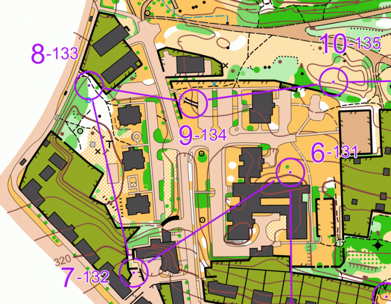
If the control description is removed, how will it be assured that the control number is easy readable and not to be mixed up with the map information. E.g. on the map above is the code 131 or 181?
Urban orienteering is easier to navigate than in forest. So sometimes organizers builds fences to make a bigger challenge to navigate. Why then we need to place a dot in control circle to make orienteering easier ?
1) Is the dot sufficiently visible to the runners at speed? Are the situations where the dot can be difficult to see, or interfere with the underlying map. Say, you place a control east of a special feature (a black ring), will the dot be sufficiently visible if the ring partly overlap the dot. Or if the control is on the side of a boulder, will the two dots, the black boulder and the purple control indicator, be distinguishable?
The course planer must be very careful on this, and the dot must not bee too small.
2) The on top/under-problem can also be solved using different symbols, for example a dot if the feature is on ground level, a ring if it is on a bridge, and a cross if it’s in a tunnel. I think it’s a good idea to keep all course-related printing in the same colour.
3) I have since long been missing some clue sheet symbols, such as a symbol for flower bed, or the ability to specify that a control is located on the southern side of a wall or hedge end.
I like the idea and suggest to try it out on minor races with elite participation and get some experience and comments from the best. After all, the dot is already in use in Ski-O and seem to work well (allthough Ski-O maps have less black content that may interfere with the dot).
I personally think this would be a huge improvement, in that it would make actual map reading the main/only issue, not the ability to combine a more or less cryptic clue sheet description with what the map shows near the center of the control circle.
As usual, the problem is most acute when you have a mixture of walls and houses, or a wall that contains multiple left/right corners in a stair-step pattern: Both of these can make it very hard to figure out where the control is actually located.
With touchless punching we have an additional problem when the control is located on a particular side of a fence (natural or added for the competition), i.e. the flag has to be located so far from the fence that it is impossible to register a punch from the wrong side! With a freely place-able purple dot this problem goes away since the control can be hung a couple of meters away.
OTOH, since the best elite runners mostly do manage to plan ahead, including reading the clue sheet and figuring out exactly where the control should be, the current setup does seem to work for them.
Reading control descriptions should not be a core-element of any orienteering. Contril descriptions should provide assistance to locating and identifying the flag and not be pre-requisite for course planning. To this extent the “dot” os of great help although there are detailed issues to be solved.
The real question for me is still, do we actually need sprint orienteering? Please misunderstand me correctly here. What I mean is that sprint orienteerign has been developed as an offspring or variant of orienteering, that has become more specialised overtime (with map standards, rules, etc.) Maybe it is time to for reinvention. Try to think of sprint as a completely own discipline. What would then be the key features and key capabilities you would propose? Running speed, quick descision making, problem solving, maze solving, puzzle laying, or ? How would then that sport look?
To that extent a flag without a feature is an option, again with some details to be solved.
I’m against. In Poland such a dot have been used sometimes when I was younger, I did not liked since it never helped and it was rather used as a correction for misplaced circle.
Now it is still used in specific competition (so called “long marches” – something that do not exist elsewhere, I think). And belive me – in detailed terrains with many features it doesn’t help – it’s just a way to make more mistakes. When you’re tired to see if the dot is violet, black, red or blue is not easy. So at control 8 one could probably look for a boulder.
I would rather displace slightly a circle to assure that it would be obvious what side of the fence the control is. I’m pretty sure that if a circle is moved about a half of milimeter everybody would understand a location quickly. And such a diplacement is not needed in every place – just where it’s really not clear which side of something impassable should we use.
I think the most fun and flexible solution would be letting the organizers decide for each control if they want to use a dot, a control description, or both. If a dot is used, then the corresponding line in the control description only needs to contain the control number and code, but the organizers can also put other information there if they think it will be helpful. Of course, as a particular case, the course setter can decide to use only dots and no control descriptions and announce this in advance. And there is no reason to make this different for sprints and for forest races. Dots probably won’t be used as much in forests to avoid confusion with boulders, but if a particular map does not have boulders, then why not?
Orienteering without control features? We used to ask such questions on April 1
Test: Erroneous “detection of duplicate comments”
Orienteering without control features? I would have asked this question on April 1
I think we do need control features in sprint orienteering. Placing controls anywhere to improve route choices might be an issue for top level courses, but it can be solved by placing them together with temporal, artificial objects. For smaller events, placing controls anywhere would add another source of error. That is nothing to aim for. Of course, this could be solved by still placing controls at features, but where is the point to distinguish (explicitely or at least implicitely) between different levels of events? Does it make sense for training runners’ routines? Will it help to explain orienteering to beginners or the media? I don’t think so!
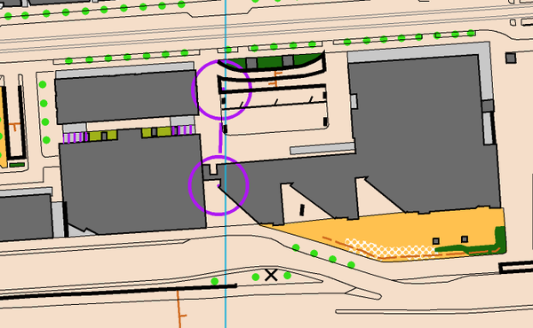
Check control 8 at Mens course on sprint Euromeeting 2015. What control feature is this? The control is just placed somewhere?!?
CP 8 is a good control location, creates route choices. No feedback concerning this control from the team leaders and runners.
It sure makes nice routechoices. But is it allowed according to the current rules?
Same comment as Jan. You can simply not place this control! Its against the rules. They should have put something there. And yes you can almost not miss this control, but you can simply not tell where it really stands. And dont know how they put it? Did they measure the distance from the edges of the building?!
Also they missed to make it impossible for the runners in the quarantine to see the last part of the course. They had a big advantage from it.
Note also the last control of the WOC sprint finals 2015.
Use of the site without an additional feature was 100% intentional. Location was easy to find for the course setter by looking at the adjacent house http://postimg.org/image/w99hxrw8j/ . Control description tells it is an open area, indicating that it is east of the impassable wall. Maybe not the perfect choice, I admit.
Organizers agree that we failed with keeping the course unknown for the runners in the quarantine. Also, the runners were starting beside a LED-screen which sometimes showed GPS-tracking that might have helped those standing there.
Mistakes were made, but Euromeeting was a test event for WOC 2017 organizers, so we will take into account what we hear from the athletes, coaches and also from the internet comments.
Markus Puusepp
Event Director and also the course setter for the sprint
Thanks for your comment. It was not to blame you as organizers. I think you have learned from those things and it helps to get really nice WOC2017.