 World of O News

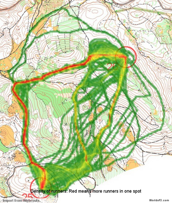
Taking the Route to Christmas series one step further, I have now set up a way to analyze your thoughts about the optimal route on the legs presented in Route to Christmas. This is done through “density maps” in which one can easily see which route the orienteering community thinks is the best route on a leg based on all the routes drawn.
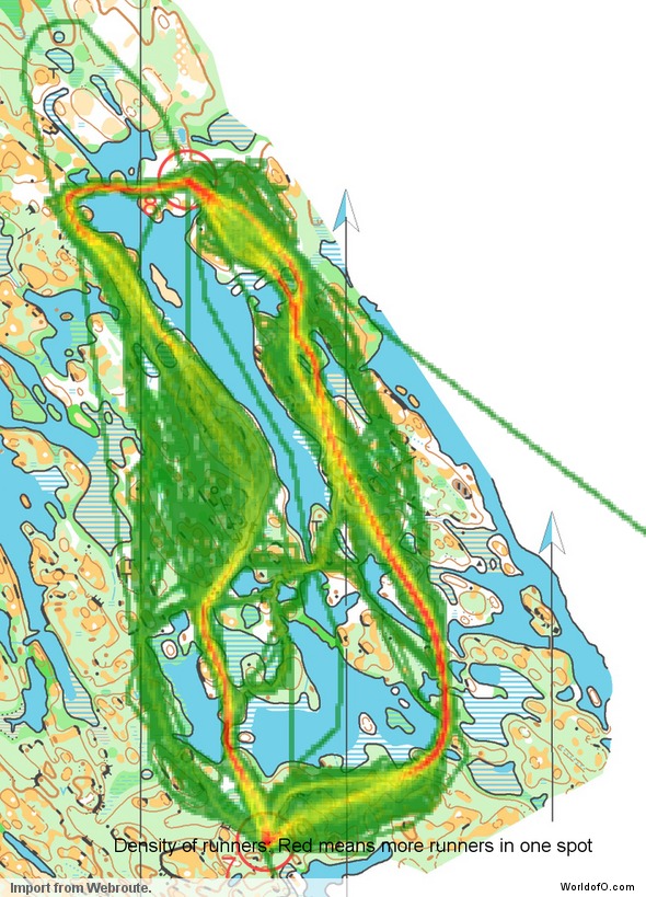
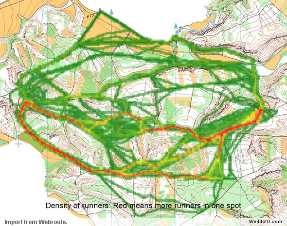
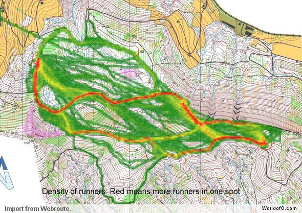
Above you see a density map from the Route to Christmas of today. The density map is made by identifying how many of you choose the different routes – visualized by a deep red color for many on a route green color for few. As you can see, most of the 120 drawing their route when this diagram was made choose a variant to the right, avoiding the big valley along the direct route. Also, quite a few choose variations of the direct route. Most of the ones choosing the direct route run straight south out of the control down the path.
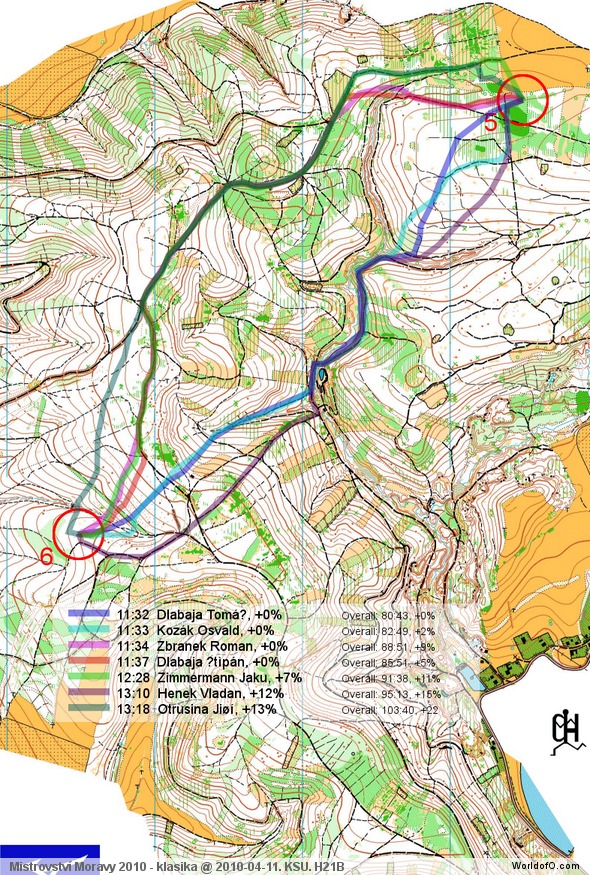
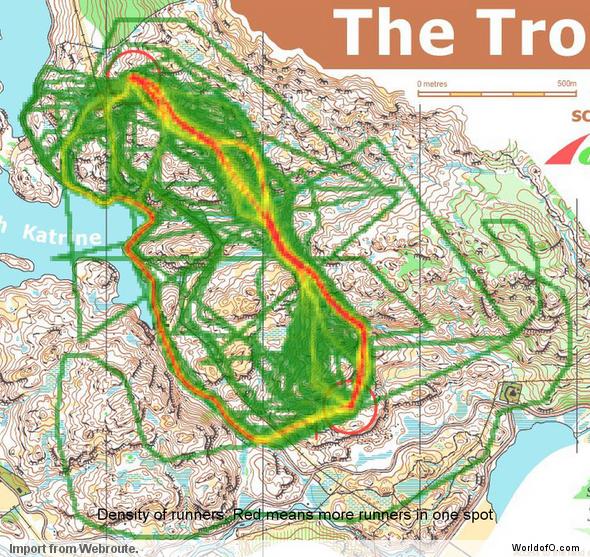
For your comparison, below is the routes chosen by selected runners in the competition in question. Looking at the direct option, none of the runners in the competition for whom routes were drawn choose to follow the path south out of the control. The reason for this is probably that the white forest is so fast that it is better to cut through the forest than to take the path.
These density maps do of course not tell anything about which route is the fastest – but it is still interesting to see what people not familiar with the terrain think about the various choices. If you have any suggestions for further improvements, please add a comment below.
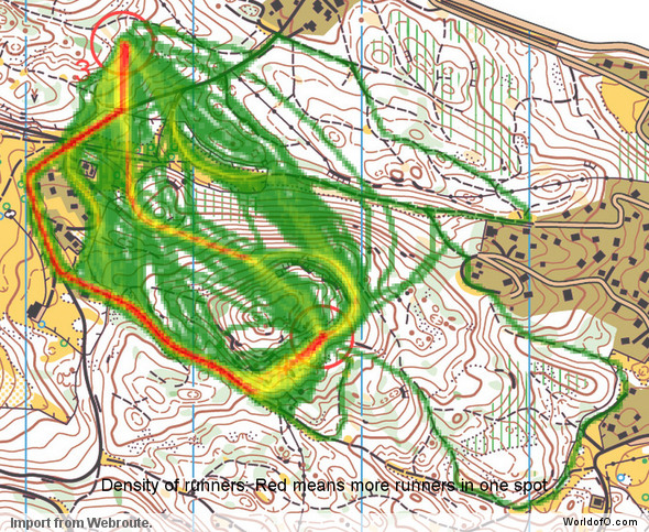
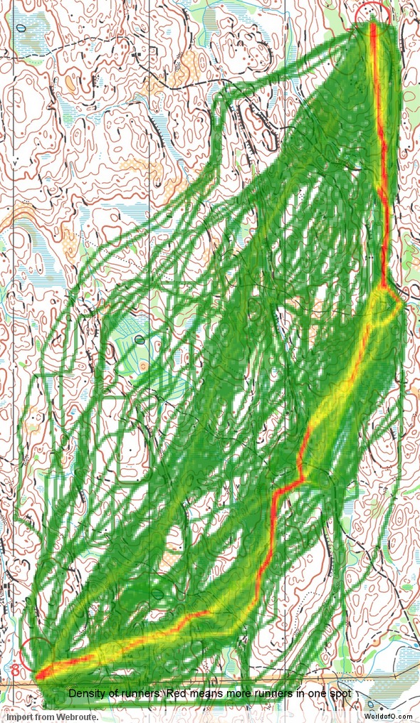
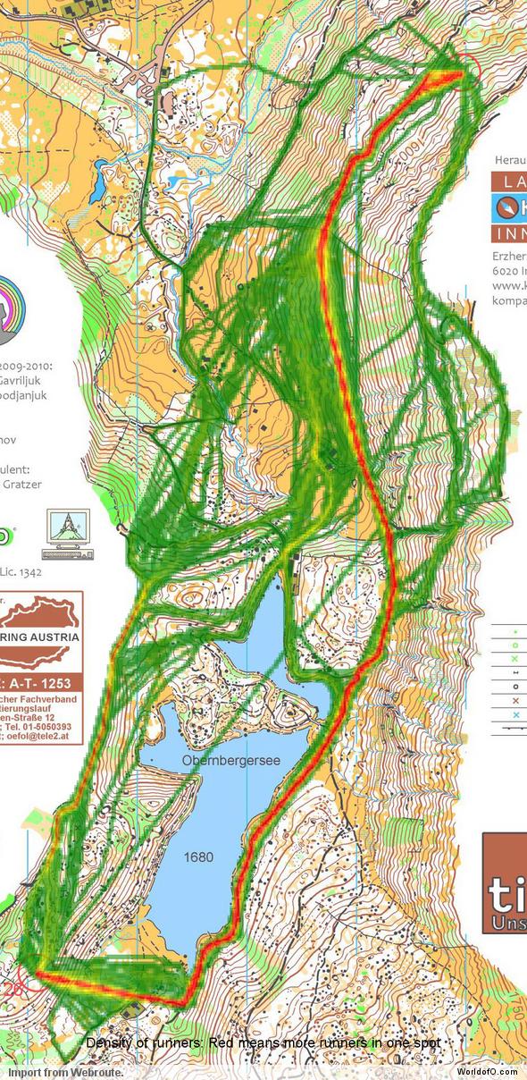
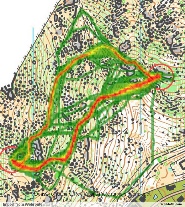
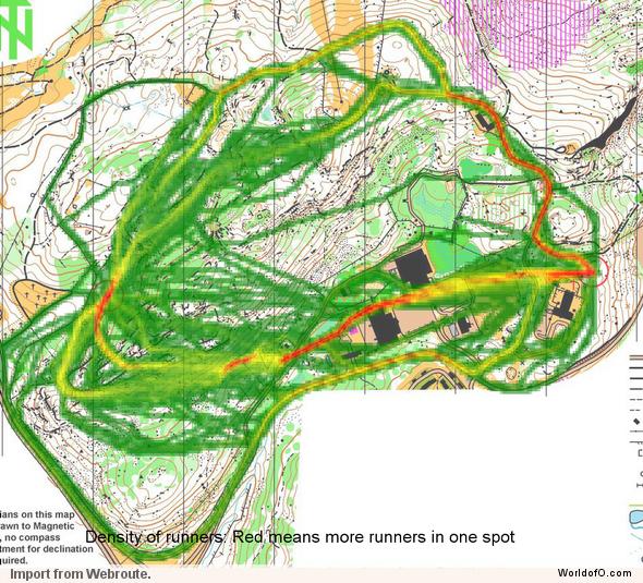
I have made similar density maps for all the days in Route to Christmas so far (see below). Note some have obviously had some fun drawing strange routes some days – they can easily be spotted in the illustrations below. Also, for some days the different routes are so spread out that it is difficult to see anything at all on the map. This is the kind of legs which are excellent from a spreading perspective – as the chances for group building is a lot reduced for this kind of legs. Enjoy!
Update! The idea to these density maps are partly based on an article on O-zeugs earlier this year, showing similar density maps based on Routegadget entries)
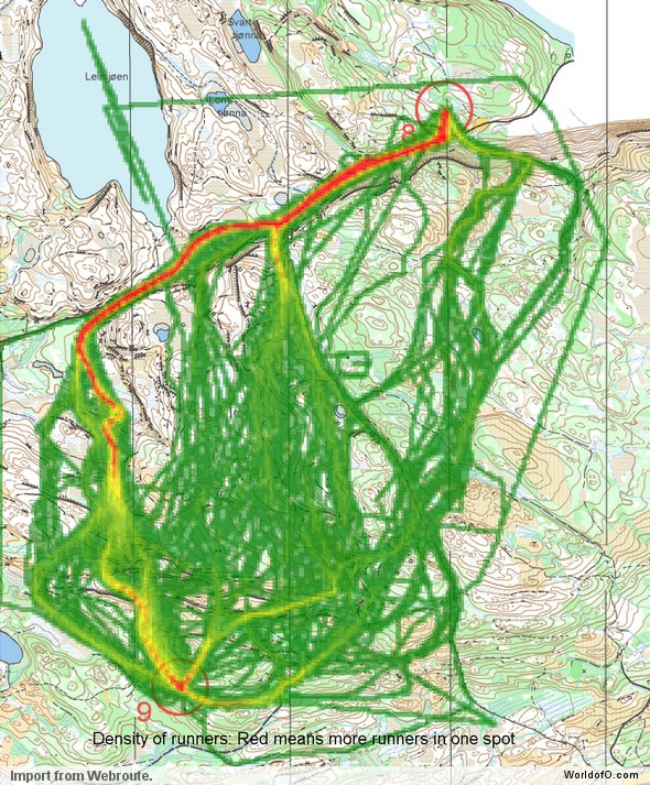
Route to Christmas 2010 – Day 1
See all information about this day of Route to Christmas here.
Route to Christmas 2010 – Day 2
See all information about this day of Route to Christmas here.
Route to Christmas 2010 – Day 3
See all information about this day of Route to Christmas here.
Route to Christmas 2010 – Day 4
See all information about this day of Route to Christmas here.
Route to Christmas 2010 – Day 5
See all information about this day of Route to Christmas here.
Route to Christmas 2010 – Day 6
See all information about this day of Route to Christmas here.
Route to Christmas 2010 – Day 7
See all information about this day of Route to Christmas here.
Route to Christmas 2010 – Day 8
See all information about this day of Route to Christmas here.
Route to Christmas 2010 – Day 9
See all information about this day of Route to Christmas here.
Route to Christmas 2010 – Day 10
See all information about this day of Route to Christmas here.
Route to Christmas 2010 – Day 11
See all information about this day of Route to Christmas here.
Nice!
Did you experiment with the cell size? It seems the results would be even clearer, with slightly bigger cells. As the routes are drawn rather raw (green skirts beside obvious track routes).
Something I would be intressted in would be, if there are differences between the most drawn and the effectively fastest as seen on day 3 or 7. Maybe you could integrate the fastest into the picture…
[see my example linked as my website]
Thanks! Yes, I did quite a lot of experimenting with the cell size, and it is visually more pleasing with this smaller cell size, whereas I guess you can get more out of it analysis-wise with a larger cell size. It also depends on the leg (obviously). Actually I made the script to use it on real GPS-data (to be published later in Route to Christmas), and just got the idea to apply it to Webroute from Route to Christmas yesterday afternoon – so it is not tweaked as much as possible.
And yes, comparing most drawn with fastest is definitely one of the interesting things to get out of this. Let’s see what I have time for:) Feel free to add analysis in the comments!
BTW: An attribution to your article on density maps (http://o-zeugs.blogspot.com/2010/04/h-35-am-2nationalen-2010.html ) should have been in the article – I just forgot when writing about it. Sorry about that – I’ve updated the article with it now!
This gives “Route to christmas” a new dimension!